Disrupting Design Interns, Comps, and Redlines
By Kevin J. Lynagh
09 October 2016 • 8 minute read
Summary: Static comps aren’t responsive. Redlines are a pain. Both fail as designs inevitably change. Can we do production work better?
The production workflow of most UI designers involves creating a pile of static comps, each representing different views and states of an application. These comps are then handed off to a development team for implementation.
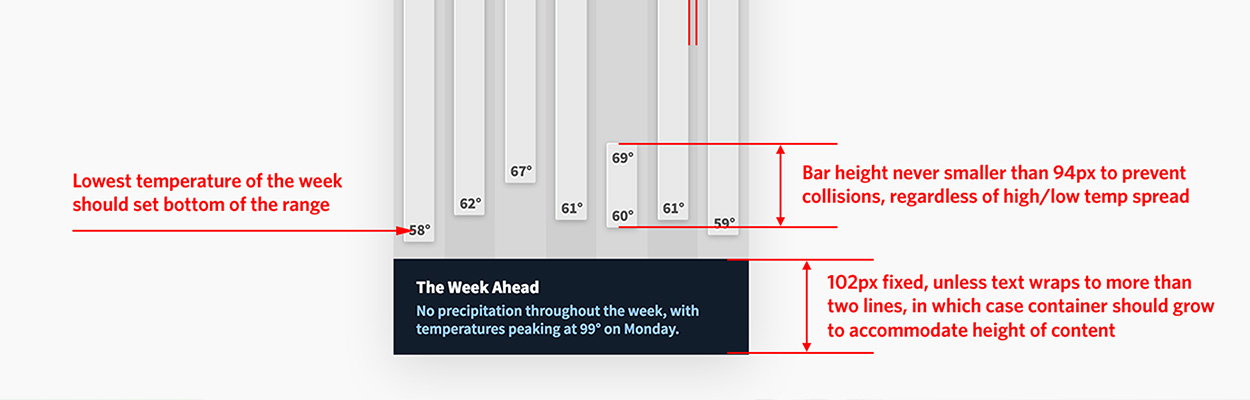
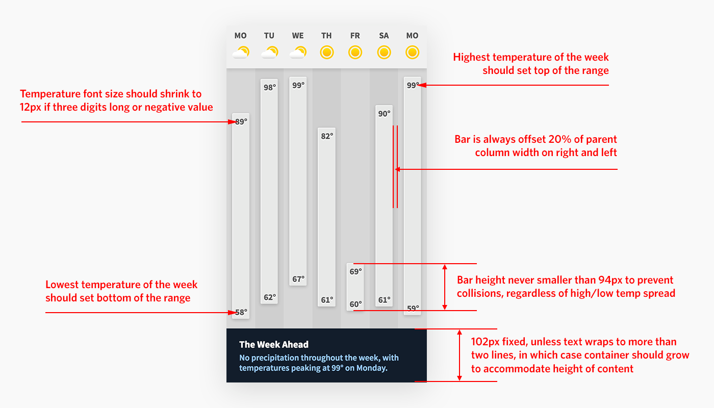
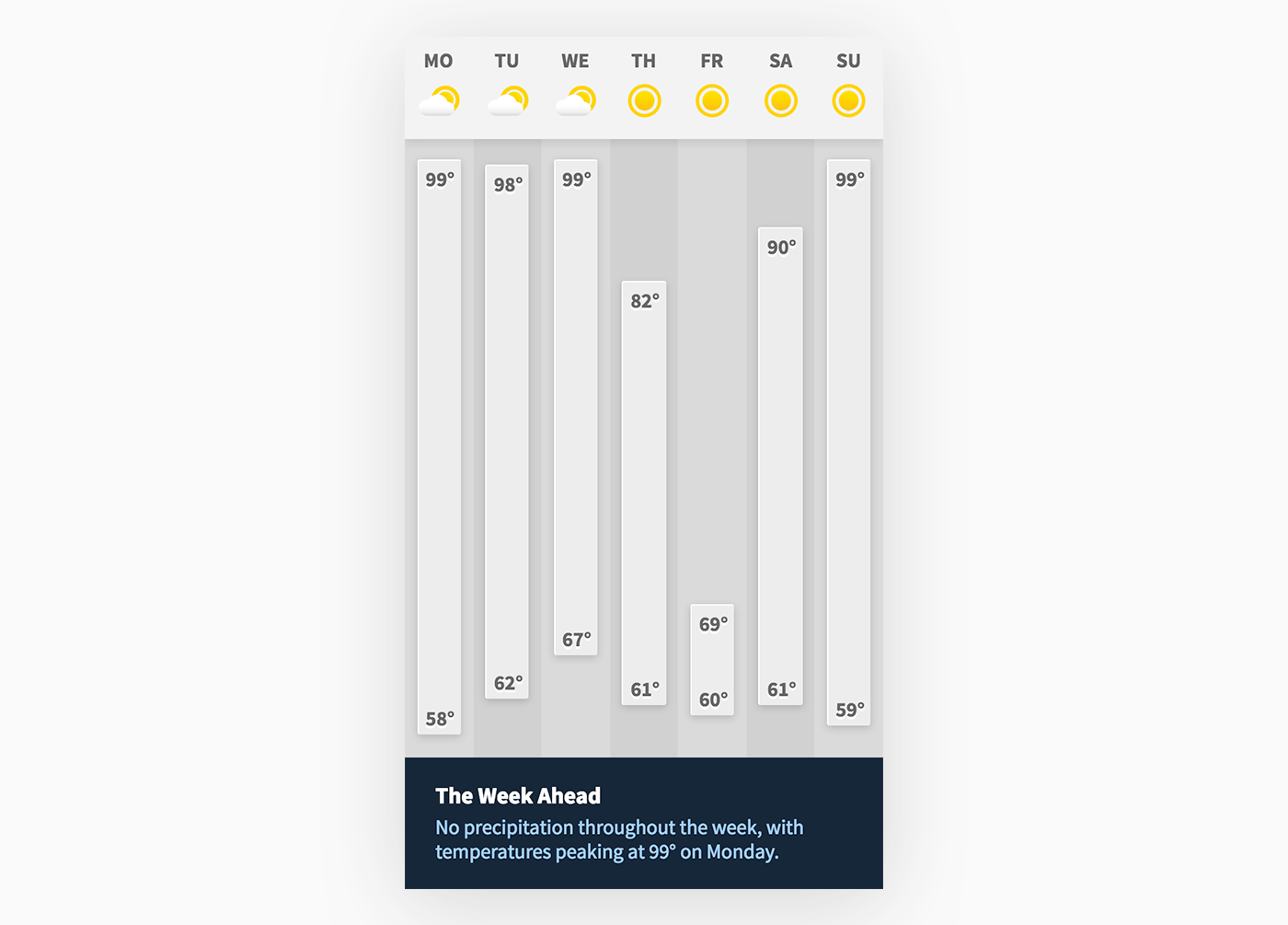
But comps can’t capture the complexity of a real user interface, which renders at many device sizes, displays various data, and must respond to user interactions. Consider this iPhone app screen:

This screenshot, although depicting a beautiful, groundbreaking iOS weather app, leaves many behaviors unspecified:
- What happens when the temperature is three digits long?
- Is there be a minimum bar height? (Without one, the high and low digits might collide on days with little temperature variation, like Friday in the example above)
- If the narrative forecast text is longer or shorter, should the containing box shrink and grow vertically, or should the text be truncated?
These details are not incidental—they’re the difference between a great design and a mediocre one.
This example demonstrates the first problem: static comps can’t fully capture design intent.
Of course, no first design survives user testing or the initial presentation to stakeholders. Change is inevitable.
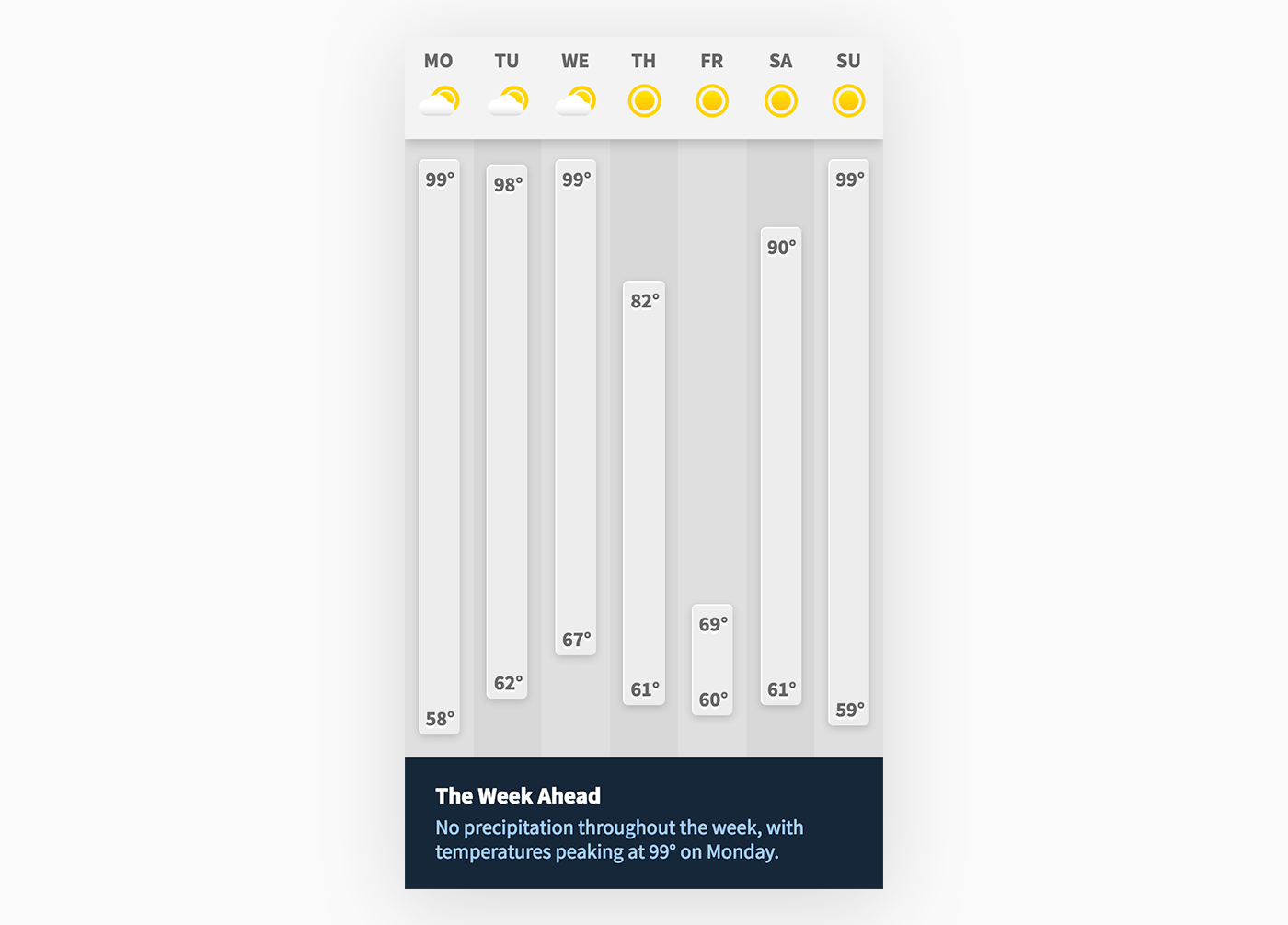
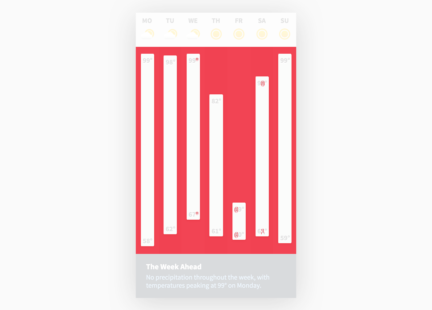
Can you tell what changed in the following revision?
Over a series of design revisions, it takes a keen eye to notice and keep track of differences in margins, line widths, and shadows.
This is the second problem: static comps are difficult to compare.
Production problems
Before I rag on static comps further, it’s worth stepping back and asking: What problem do we expect comps to solve?
In the context of production design work, we’re asking static comps for two things:
-
To capture our design intent
-
To convey that intent to other designers and developers
We ask our comps to do this not just for the first implementation of the product we’re designing, but for all of the changes and improvements as the product evolves over time.
Now that we’re designing complex, responsive apps, static comps just don’t scale—no matter how many interns or long evenings we throw at ‘em.
Let’s look at other approaches digital designers are exploring.
Redlines
A common approach today is for designers to document their intent in separate artifacts like redlines and style guides. These are then passed to the development team alongside static comps:
This seems like a great approach. After all, who’s against documentation?
Well, there are a few issues.
First, such documentation is incredibly time consuming to create and keep up-to-date.
Sure, some tools like Zeplin can generate style guides and redlines from Sketch and Photoshop files. But illustration and photo-manipulation software can’t capture the design’s intended behaviors like the minimum temperature bar height or how elements should move and resize on different device sizes.
If the design software can’t capture that intent in a file, automated redlining tools can’t pull it out. Designers must remember to manually specify every responsive behavior.
The second issue with redlines is that they split the design across multiple artifacts: static comps, redline overlays, written PDF style guides, etc.
This might be fine on day one, but as soon as the design evolves, everything gets out of sync.
Not can get out of sync, but will get out of sync.
When you update a button in the style guide, do you regenerate every comp for every screen that contains that button? No, you just tell the developer “yeah, the comps I sent you Tuesday, except do this other thing with the button”.
(Well, maybe you don’t do this, diligent, hardworking, and stylish reader—but your coworkers might.)
When a designer inevitably forgets to call out a subtle detail or there’s a discrepancy between comp and style guide, forward progress halts while emails, Slack messages, and taps on the shoulder fly.
Obsessive over-the-shoulder
Some teams, rather than build redlines that immediately go out of date, skip directly to this intense designer/developer communication.
Developers rough out a prototype from plain comps, wire up the data, and call over a designer for a long, side-by-side conversation full of exchanges like:
-
“Ugh, who has a name that long? Make the type smaller.”
-
“No, the left side of these two boxes should be aligned.”
-
“You forgot the 2px border radius on all the images.”
This is boring at best, deeply frustrating at worst. And you gotta do it every time the design changes.
What’s worse, by turning the agile up to 11, we’re no longer capturing the design thinking within artifacts. That thinking, if it’s recorded at all, is spread out across hundreds of emails or Slack exchanges—so there’s no way to share that knowledge with new team members.
If you’ve been on either side of this process, you’ve probably wondered “is this the best way to work?”
What’s next?
So where do we go from here?
How do we capture design intent and communicate it as designs change?
Or, put another way, how can we streamline our production workflow?
Answering that question is why Ryan and I created our design tool Subform.
Systems thinking
The core idea behind Subform is that designers should create design systems—reusable components, style classes, responsive layout—rather than just static images.
This insight isn’t uniquely ours; it’s what Brad Frost's Atomic Design is all about, not to mention industrial designers with 20+ years of CAD tools.
But to leverage the power of systems thinking, tools must understand it.
Designing systems with illustration and photo-manipulation tools is an altar upon which countless interns and weekends are sacrificed.
But Subform understands design systems, and can be used to more effectively communicate designs and manage production workflows.
Visual diffing
For the problem of “what changed?”, Subform can just tell you.
Here’s a visual diff of the two images I showed earlier:
This makes changes obvious, which is helpful to developers who don’t have eagle-eyed designers standing behind ’em pointing at stuff.
Of course, anyone can run ImageMagick’s convert command or use Github’s image view modes to generate a diff—that’s not unique to Subform.
What is unique is that, because Subform designs are systems rather than images, the diffs aren’t just about artboards.
In a design with dozens of stateful components on hundreds of screens, wouldn’t you want to just see the pieces that changed?
In this example, even though we have a several components and artboards, Subform points out just the differences between versions—that a new “today” artboard was added and that the “condition icon” component had two changes: its partly cloudy state updated and a new state, sleet, was added.
The leverage due to changing your perspective from static artboards to composable systems is hard to overstate.
It means you (or your interns) can stop obsessively hunting through files and instead focus on improving your design.
Of course, visual diffs aren’t the whole story—as we know, static images can’t always communicate intent.
A trivial change in intent might lead to a massive visual change. Take this third revision and the diff against the first:
The minor adjustment of the grays in the zebra-striped background caused a huge change in the diff—enough to disguise the second change (can you spot it?)
So while visual diffs are easier to create and oftentimes more helpful than redlines, we need to go further.
Code export
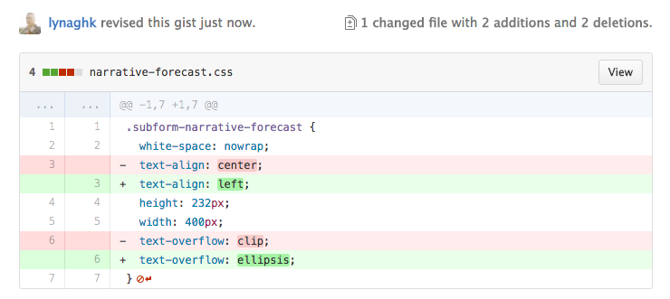
An even more powerful approach we’re exploring with Subform is enabling designers to communicate their intent directly through code export.
When described via code, a design’s intended behavior is no longer ambiguous. In our iPhone app example, the temperature bar layout was unclear:
“If the narrative forecast text is longer or shorter, should the containing box shrink and grow vertically, or should the text be truncated?”
With exported CSS, we can answer this question at a glance. The text should be a fixed height and truncate with an ellipsis:
.subform-narrative-forecast {
  white-space: nowrap;
  text-align: left;
  height: 102px;
  width: 400px;
  text-overflow: ellipsis;
}
Of course, there’s nothing special about HTML/CSS—for a mobile app the development team probably prefers Swift:
var narrativeForecast = UILabel(frame: CGRectMake(0, 0, 400, 102))
narrativeForecast.textAlignment = NSTextAlignment.Left
narrativeForecast.text = "No precipitation throughout the week, with temperatures peaking at 99° on Monday."
narrativeForecast.lineBreakMode = NSLineBreakByTruncatingTail
The point here is not that Subform has a “press here to deploy” button.
The point is that code export allows designers to speak in terms of the product medium—just like how an industrial designer’s SolidWorks file tells the fabricator the required grades of stainless steel and milling tool paths.
Another benefit of exporting code is that, developers can compare code *far *more easily than they can compare visual comps.
You can quickly find out the differences between two designs by exporting code and taking a look on Github:
Unlike image diffs, code diffs illuminate both visible (the text alignment) and invisible (the text overflow behavior) changes.
Cool, I’m in.
Subform is emphatically a design tool, not a WYSIWYG code editor like Dreamweaver.
Subform’s focus is not on exporting production code (although it does export well-organized classes). Rather, code export is a way to create a standardized, versionable record of a UI design that preserves the designer’s intent, while making implementation and change-tracking easier for the developer.
We’ve started with HTML and CSS because they are mature, widely-used structural and styling languages.
Subform’s foundational tech could just as easily export to preprocessor languages (e.g., SASS or Less.js), native constraint engines (like Apple’s Auto Layout system), and JSON for the programatically-inclined.
Which of these languages Subform will support depends on how you work—Ryan and I are committed to tailoring Subform to the workflows of our Kickstarter backers.
Thanks to Nicki Vance (@wootbeep) and Ryan Lucas (@ryanlucas) for helpful feedback on this article.