Better Grid Systems in UI Design Tools
By Ryan Lucas
14 March 2017 • 8 minute read
Summary: UI/UX designers need better ways to work with grids during visual design. Digital designers must be able to explore the consequences of grids visually, not just in code. This article takes a look at the pain points—and some of the solutions we've come up with in Subform.
In the first part of this article, “Are Grid Systems Still Relevant in Digital Product Design?,” I took a look at the history of grid systems and their practical advantages. In short: grids are still useful for interface design, but the screen is much more complex than the printed page, as both the output media and content are highly variable.
So what’s wrong with grids in UI design tools?
Software developers have tools to help manage screen layout complexity: constraint systems like iOS’ AutoLayout and Android’s ConstraintLayout, Flexbox, and even grid-specific frameworks like the upcoming CSS Grid. But layout decisions should be made by designers, not delegated to developers. They’re critical to the form and function of an interface. Designers must be able to explore the consequences of grid layout decisions visually, not just in code.
75% of interface designers primarily use Photoshop, Illustrator, or Sketch. Each of these tools was created around the metaphor of the page, not the screen. Unsurprisingly, the methods for working with grids in these tools are also based on the print tradition. For digital product designers, this leads to some big pain points in everyday use.
Responsiveness
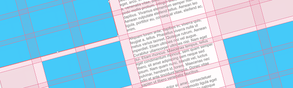
To create a grid, you typically set parameters like total width, number and width of columns, gutters, and margins:
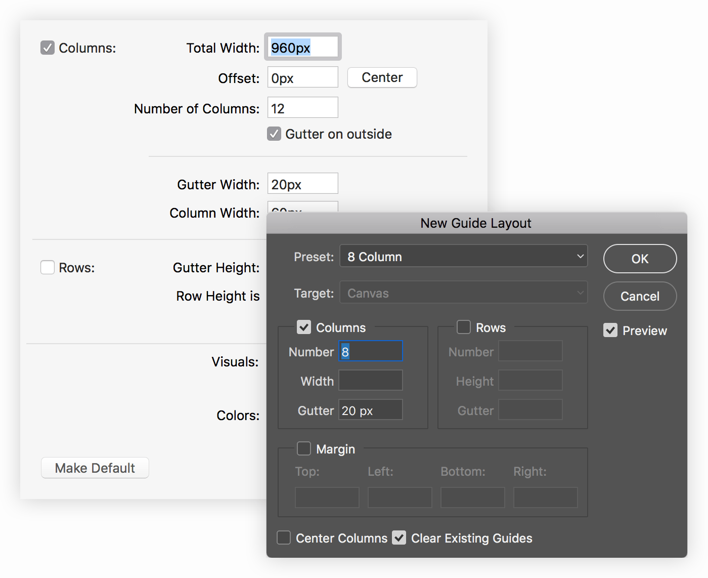
This creates a grid scaffold that is drawn as a set of guide lines on top of the artboard. Elements can then be manually snapped to these guide lines:
This works fine for print. The designer knows that their publication is going to use, say, the A4 paper size. But what happens in digital, when you need to simulate a different device size? Changing the artboard dimensions means that the grid either is either too big or too small:
The most common workaround to this problem is to create multiple artboards, each corresponding to a unique device category, like smartphones, tablets, and desktops. Individual grids can then be created separately for each device/artboard:
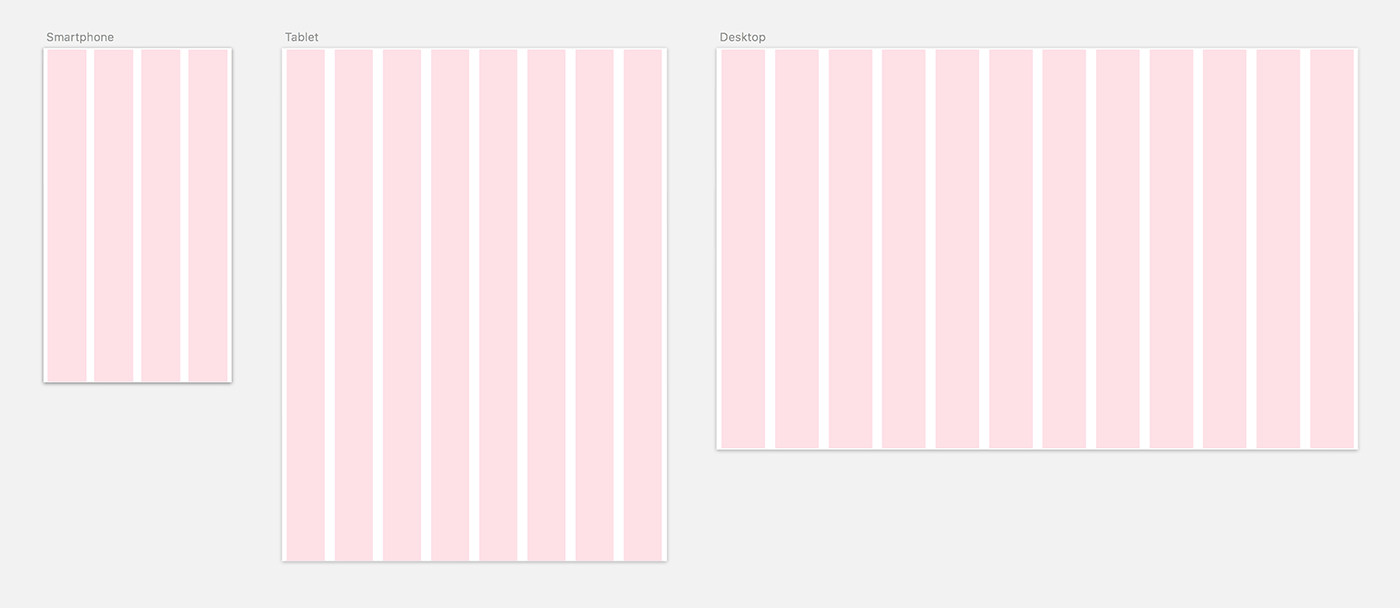
This is a pretty lousy simulation of output media, though, as it only represents three potential device resolutions. (In the above example, it’s the iPhone 7, the iPad, and a 13" Macbook Pro.) Are the grid decisions still sound on a Google Pixel or an iMac 5K? What about in landscape orientations or split views?
Working with only few fixed grid configurations makes it easy to miss problems while you’re working. Either the developer will find them during implementation—necessitating a lot of annoying back-and-forth—or the broken layouts will end up in your final product.
Propagating changes
In the influential Grid Systems in Graphic Design, Josef Müller-Brockmann calls for grids to be specified at the start of a project, before any page layout occurs. In fact, Müller-Brockmann suggests knowing all the variables of a project before specifying the grid:
“Before work can begin […] questions regarding the format, the text and illustrations, the typeface, the printing method and the quality of paper must be cleared up.”
These variables, of course, can have an impact on the grid system. For example: reading distance influences font size decisions and font sizes impact column widths and row heights. In print, these variables are knowable and don’t typically change. A book doesn’t suddenly become a newspaper.
So it’s not surprising that print-legacy visual design tools were never designed to handle these kinds of changes. Subtracting a few units of width from the gutters—or adding in a couple more columns—means that you have to manually realign all elements to the new grid lines:
For UI designers, grid changes are often necessary. It’s just not possible to account for every output and content variable before starting visual design.
Furthermore, while print projects are complete when they go to press, software interfaces are never “finished.” They’re constantly being iterated and improved.
As shown above, though, a simple change to the grid means manually realigning every element in a design. Multiplied by hundreds of screens, a grid change can mean hours (or days) of miserable pixel pushing.
Experimentation
When constructing a new grid, Müller-Brockmann would make small hand sketches of potential configurations. The technical difficulty of the process was apparent even to him:
“In sketching a grid, care must be taken to ensure that the sketch corresponds as closely as possible to the proportions of the final printed format. […] Only in this way is it possible gradually to acquire the ability to produce, even in very small sketches, typographic patterns which are realistic, i.e. which can be transferred to the final format without difficulty.”
—Josef Müller-Brockmann, Grid Systems in Graphic Design, pgs. 94, 49
Of course, this was the only means for Müller-Brockmann to cheaply experiment with possible grid layouts: he didn’t have access to the computer in 1981. It’s pretty puzzling, though, that nearly 40 years later, computer-based design tools still don’t facilitate this sort of experimentation.
Much of the time, you quickly want to divide up some elements across the available space, either evenly or in proportion. This is a grid like any other, but defining a grid scaffold to do this feels premature in the early process of exploring layouts.
Time to break out the calculator. Get the width of the containing space, subtract the number of gutters multiplied by their width, then divide the remainder by the number of elements. Draw an element with the result, duplicate it for each column, then distribute all of them evenly:
This is straightforward enough, but manually doing calculations like this doesn’t keep up with the speed of thought. When you start asking questions like “will it be too small if I put 8 photos on this row instead of 6?”, doing the maths each time is tedious and discourages quick experimentation.
What might better grid tools look like?
All of these pain points lead to one conclusion: UI/UX designers need better ways to work with grids during visual design. Kevin Lynagh and I have been working on some solutions in our UI design tool, Subform. Let’s look at the principles (and examples) that we’ve come up with thus far. (All of these demos were recorded directly from Subform.)
Grids should be responsive by nature.
For grid systems to work across lots of different devices, you should to be able to specify values in flexible percentages and proportions, not just exact pixels.
These values allow you to build a simple responsive grid very quickly, without doing any arithmetic. You simply set a number of columns and tell each column to stretch. The columns then evenly divide up the available space, based on the width of the artboard:
Stretchable columns can be mixed with fixed columns, gutters, and margins. The gutters in the above example are set to 12px, so their width stays fixed as the artboard resizes.
A stretchable column can also accept proportions. This opens up interesting possibilities for non-uniform grids, like specifying that one column should always be three times as wide as the others:
Working this way makes it much easier to understand how a grid will work across different device sizes and orientations—and catch any edge cases before they get passed to the development team.
Forget guides and snapping—elements should have a formal relationship to the grid.
In existing tools, the grid is just a collection of guide lines that overlay the artboard. Elements can be snap-aligned to these guides, but that’s all. The elements don’t know anything about their larger relationship to the grid.
The thing is, a grid is the relationship between elements. Guide lines are a visual hack to assist in creating those relationships manually. It’s far better to build those relationships directly.
For example, you should be able to place an element using a rule like “start in column 2, then span 4 columns.” This can be done implicitly via direct manipulation, or explicitly by using a shorthand like 2 / span 4. Now when the grid changes, the elements will automatically resize and preserve their alignments:
This also opens up new possibilities for the direct manipulation of the grid itself, like resizing gutters and columns:
Grids should enable fast experimentation.
Being able to define grids informally while working—without using a calculator—is also a much needed feature. You might want to add some elements to the artboard that automatically divide up the available space, then insert evenly sized gutters between them:
Having the design tool do these calculations on the fly—instead of painstakingly doing the math by hand—makes experimentation fast and visual. Questions like “how many photos should display in a row on the smartphone?” can be easily tried out in seconds, rather than after lots of painstaking, tedious pixel pushing:
Two-dimensional grids shouldn’t be overlooked.
Column grids cover a lot of use cases, but many layouts require both columns and rows, similar to Müller-Brockmann’s modular grid. You should be able to describe elements in both of these dimensions: “Horizontally, this element should start in column 3 and span 2 columns. Vertically, it should start on row 1 and end on row 2.”
As with one-dimensional grids, resizing the grid in either direction automatically reflows the content. Subform can also calculate changes to the grid, like adding gutters, in real-time:
Anything should be able to contain a grid.
Existing tools only allow a grid to be defined for the entire artboard, but that’s an arbitrary boundary. Grids are helpful to solve lots of design problems, not just screen-level layout.
Any rectangular element should be able to contain a grid. A table, for example, might need a separate grid structure from the screen it lives on:
The ability to use multiple grids and nest them also opens up a lot of creative expressiveness for the designer. (Karl Gerstner did some pretty cool work with multiple overlaid grids for Capital Magazine in 1962.)
Conclusion
While building Subform, Kevin and I are constantly exploring how we can create a tool that maintains the immediacy and expressiveness of visual design, but adds the dynamic power of computation.
In Media for Thinking the Unthinkable, Bret Victor proposes that to think about complex systems, new representations are needed—representations more powerful than the paper medium. The representations that we’re developing for grid-based layout are, we hope, a step in the right direction.
And perhaps they’re even something that Joseph Müller-Brockmann might recognize: design tools for the “clearly intelligible, objective, functional, and aesthetic quality of mathematical thinking.”