Hey, UI/UX Designers. Stop Pushing Pixels.
By Ryan Lucas
24 October 2016 • 5 minute read
Summary: Constantly shifting around elements in tiny pixel increments is one of the biggest time sinks during the visual design process. What if the computer did this work for you?

Direct manipulation is great…
The common tools used in UI/UX design today all basically work the same way. When you want to add an element to your design, you pick a shape and manually draw it out on the artboard. If you need to transform it somehow—adjust the size, move the position, rotate it—you grab a handle on the bounding box and make that change. Simple enough.

This style of interaction is called direct manipulation. You’re performing the task yourself (clicking the rectangle and making it bigger), not asking the computer to do it for you. In drawing tools, direct manipulation can be traced back all the way to 1963, when Ivan Sutherland introduced Sketchpad.
Thanks to the work of Ivan (and many others), computers got a lot easier to use for designers. It’s often hard to know exactly how a design should look or work, especially in the early conceptual stages. You just want to experiment quickly, with as little friction as possible between your ideas and the medium. Direct manipulation makes designing on a computer more immediate—like sculpting a block of clay.
…but pixel pushing is miserable.
As things leave the conceptual phase, though, only having direct manipulation tools is limiting. This is particularly true in product design, where the artifacts being created are systems with functional relationships, not just static images. Imagine, for example, that you’re designing a team scheduling application:
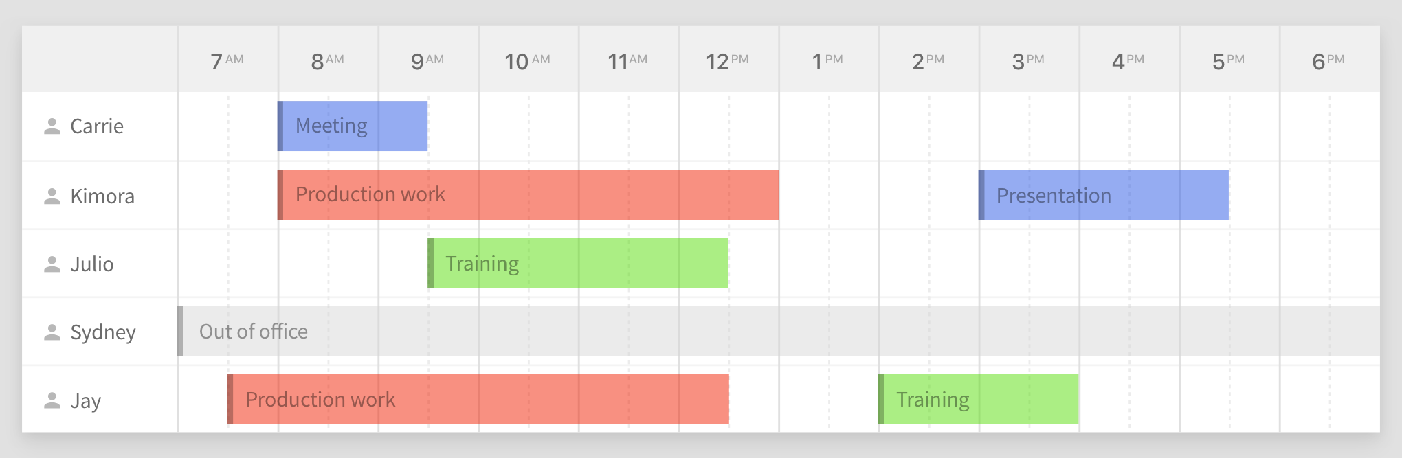
The schedule table is composed of many different elements: lines separating the day into half hour increments, text labels for times and team members, colored blocks representing tasks, and so on. You’ve worked through multiple iterations of the design, drawing and aligning all of these elements carefully, spending a lot of time making sure everything is pixel perfect. But after a few rounds of review with your team and/or clients, the inevitable changes come up:
-
Can we show more team members without having to scroll?
-
Can we see it with 15 minute increments instead of 30?
-
Can we make the whole thing narrower so there’s room for a sidebar?
Just like that, the design you spent hours perfecting is now obsolete. You’re going to have to spend a lot more time adjusting everything into new comps for the team.
Let’s look at the first requested change: Can we show more team members without having to scroll? To fit in the extra team members without making the table larger, each row needs to be shorter in height. You’ll have to break out the calculator, then manually reposition and adjust the spacing on each element. Here’s what that looks like in hyper speed:
And that’s just one change. Multiply this by a laundry list of changes, all the different screens in an app, multiple rounds of reviews and iteration, future feature additions… ugh. This pixel pushing ends up being where you spend a huge chunk of your work day. But wouldn’t it be better if you could spend your time designing?
There’s a better way.
All of this manual work stems from one problem: direct manipulation tools like Photoshop and Sketch don’t understand your design intent. They know an element’s height, width, and position on the artboard. That’s it. They don’t know how elements are supposed to work together, or what to do when things change.
The thing is, computers are really good at managing repetitive tasks—they just need rules to follow. What if you could communicate the rules that govern your design to the computer?
“Text should always be vertically centered in a row, no matter its height. And rows should never be shorter than 44px.”
This is exactly how Subform’s layout engine works. Now that the computer knows your design intent, adding rows for additional team members is trivial. Here’s what that same change looks like in Subform, in real-time:
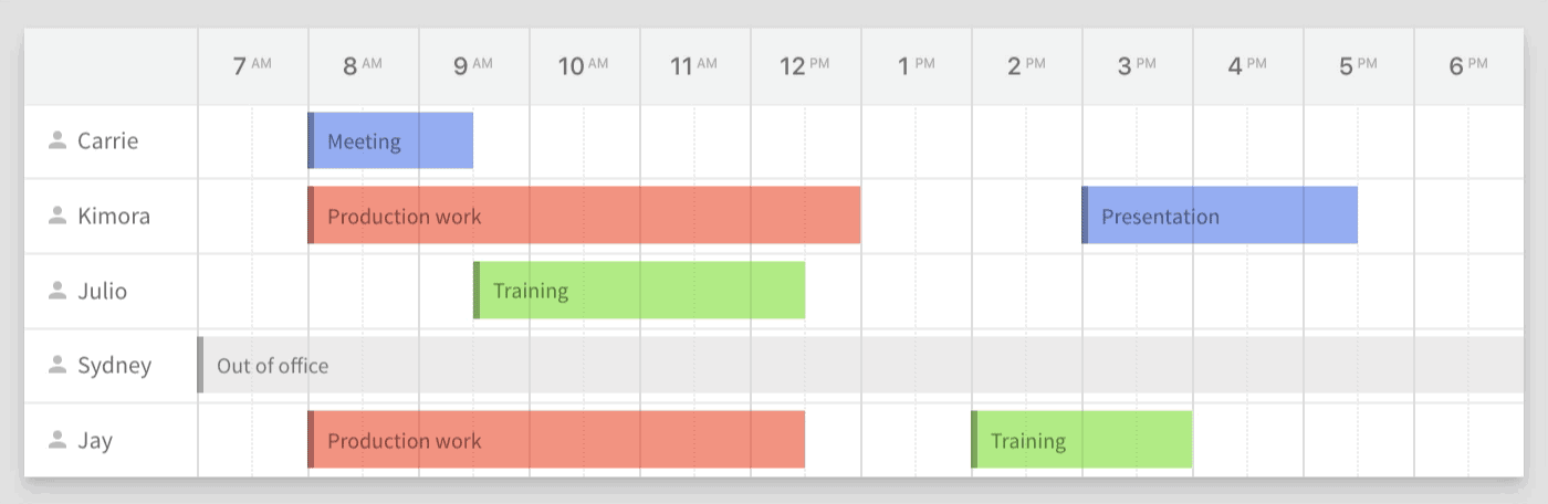
The available space is automatically divided up. A change that previously took 5 minutes just took 15 seconds.
This isn’t to say that Subform is abandoning direct manipulation altogether. A professional UI/UX design tool needs to understand both models: allowing you to quickly get your ideas down on the page and easily propagate changes across an entire design system. Subform’s layout engine enables you to switch elements back-and-forth between these two models at will.
We’re building a tool for the future.
Digital products are becoming too complex for us to take them from conception to production using our current, direct manipulation tooling. We need tools that retain the intuitive power of direct manipulation and extend it by embracing the computational reality of design.
The explicit goal of Subform is to fill that gap. We’re working hard to create a design environment that balances the freedom to express ideas fluidly with the production realities of iteration and shipping product. Designing with Subform is a little bit different from what you might be used to, but the initial learning curve pays off in spades. It feels like a superpower.